Good Company Project
Date: Fall 2021
Timeline: 12 weeks
For: Academic module at Northeastern University for the course "Usability and Human Interaction"
Stakeholders: TrademarkVana, GoodCompany
Team Size: 4
Roles/ Responsibilities:
-
UI/ UX Designer
-
Product Designer
Tools: Figma, Adobe Photoshop

Download the Project PDF
Link to Video Walkthrough
View on Figma
The Problem
Our client Good Company is a 501(c)(3) non-profit organization that strives to give opportunities to historically disadvantaged, disenfranchised, and underrepresented entrepreneurs and their startups. The website intends to give more exposure and foot traffic to the organizations and companies that it showcases. Their current website is in need of stronger site navigation, branding clarity, and functionality for users.
The Solution
After conducting market research, competitor analysis, and brand discovery, Team Strive together gained insight on the challenges of the site and pain points for its users. Through iterative redesigns, and interactive prototype screens, we improved and enhanced the user experience of the site.
Research
Competitive Analysis
We found 3 competitors against Good Company:
-
Rising Tide Capital
-
Bread for the City
-
Seyfarth
Through inidividual SWOT analyses, we coalesced our findings into one matrix table for easy comparison.
We found that many of the competitors' websites in general had more informational content, stronger branding and messaging, and more features and resources that allowed for streamlined call to actions.

Market Research
We needed to determine the overall demand for this type of site within its respective industry by assessing the challenges that entreprenuers and startups face on their own. Using trusted sources like Statista and the Small Business Administration (SBA), we summarized our inisights below:
-
General
-
There were an estimated 31.7 million startups in the US by 2020
-
From 2017 to 2020, the startups in the US grow at a rate of 3.15% increase from the previous year
-
Roughly 627,000 startups are created per year on average in the US
-
77% of startups rely on personal savings for their initial funds, and only 0.05% of startups raise venture capital
-
Usually startups with two co-founders instead of just one raise 30% more capital in general
-
Startups get around $2.2 milion on average for funding
-
-
Common Challenges:
-
Competition: The competition between companies, such as ideas, market, etc
-
Lack of funding: Startups need substantial amount of money to cover costs
-
Extreme Time Commitments: There is always not enough time to complete what needs to be done
-
Poor Planning: It could be estimating the operating costs, initial marketing campaigns and projecting finances
-
Marketing & Reach: They might have a hard time getting their name out there
-
-
Common Resources for Startups:
-
Accelerators: Provide resources, networking connections and business development opportunities
-
Coworking space: Provide networking and community-based resources
-
Business competition: Participate competition can jumpstart the startups
-
Angel investors: They provide early-stage funding
-
Venture capitalists: They provide financing in exchange for equity
-
Persona, Journey Map,
and Empathy Map
After gaining insights through research and conversations with the CEO Donald Frugé, a total of 3 personas were created along with their respective journey maps and empathy maps in order to empathize with the target audience. For brevity we stuck to using 1 of the personas for our final prototype walkthrough at the end of the project.
Our main persona is Steven Chang, a small business owner who runs his own store. He's passionate about business management but is new to running his own start-up. Like many others, he needs guidance in growing his brand and advice on managing his website.
As expected, he's usually very busy and often finds it hard to find balance between his work and daily life.


Design Process
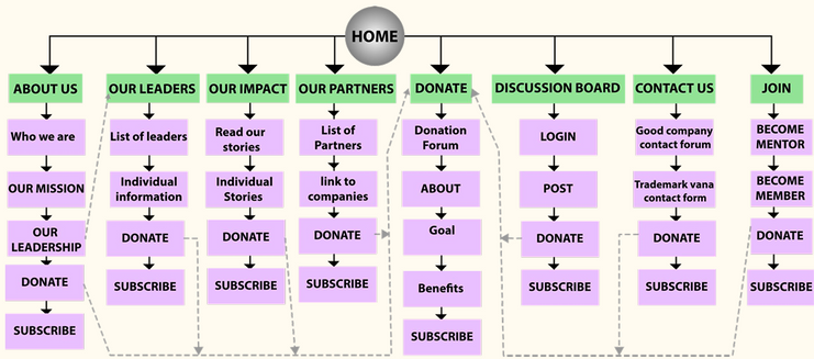
Site Map
The existing site has disorganized informational hierarchy. In order to streamline user navigation we went through their website and devised a new site map by combining and eliminating their existing pages. Our main landing pages included the following:
-
About Us
-
Our Leaders
-
Our Impact
-
Our Partners
-
Donate
-
Discussion Board
-
Contact Us
-
Join
Sketches


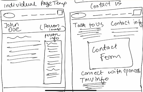
Low-Fidelity Wireframes
After some initial sketches, I started developing our low-fidelity wireframes. In this stage I primarily focused on page layout and spacing of content without color, font, images, or interactivity.
You can also download the high resolution images of the wireframes below for easier viewing.


High-Fidelity Prototypes
After extensive feedback from our professor and our client, the final prototypes were developed. In this stage I created a style guide to follow and focused on adding real content such as text, images, and color. Several minor and major changes were made to page layouts and the final task was to add interactivity to the screens for presentation.
You can download the high resolution images of the protoypes below for easier viewing. Click the other links below to view either a video walkthrough of the project, or you can look through the files yourself on Figma.
Link to Video Walkthrough


Learnings & Takeaways
Ideas for Revisions
This was my very first UI/UX project, and my first class at NEU, so everything I learned while working on this project was new to me. My background is in Studio Art, and I never had any experience in web development prior to this course.
The key takeways I learned from this project were the fundamentals of UI/UX and the process of iterative design flow. Not only did I learn about how to create site maps, wireframes, and prototypes, I also learned how to use Figma for the first time. Working in a group of 4 also helped me practice my communication, hone my leadership skills, and also improve my time management skills.
By working closely with a real client and doing market research through personas, I gained genuine appreciation for the work I was creating which made the project rewarding.
-
The site map could be reworked and redesigned so that it's even more compact and concise. For example, now that I have more experience, I don't think the site benefits very much from having a discussion board.
-
The color palette could be tweaked, and visual hierarchy using color could be improved. For example, the user forms use a light blue as the background color but this is a rather odd choice and distracts from the purposes of the forms.
-
General spacing and text size is okay, but the aesthetics of the site could be stylized more in order to make it unique and inviting.
-
Visuals and imagery could be changed to improve the brand narrative and build more connection to the target audience.
-
Minor inconsistencies with the button fonts could be fixed