Business Card
Design Project
Date: Jan-Feb 2024
Timeline: 4 weeks
Stakeholders: Independent client (Confidential due to NDA)
Roles/ Responsibilites:
-
Independent Design Consultant
-
Graphic Designer
Tools: Figma, Adobe InDesign, Adobe Suite/ Express

Download the Project Presentation PDF
(Currently being updated)
The Problem
My client requested help from start to finish with brainstorming and designing a personalized business card in order to help professionally present himself during formal meetings and networking events. The only requirement he specifically requested was that the design had to include a QR Code that redirects to his LinkedIn profile. Other than this, he had no prior knowledge on how to begin the design process.
The Solution
Over the course of several weeks, I walked the client through various stages in the design process. We began with determining a general look and feel by presenting several iterations for text layout and a simple color scheme for both the front and back sides. Through the addition of developing a lettermark from scratch using his initials, and a patterned motif, I was able to enhance visual interest to the design.
Each round of revisions based on direct feedback helped to achieve client satisfaction by narrowing down the designs to better suit his personality, interests, and preferences while adhering to the requirements per the project.
Please note that all designs have been edited to replace any sensitive personal information. All designs use ficticious information, including the QR Code.
Initial Questions
and Goals
Brand Discovery & Research
To begin the project, I asked the client for his basic contact information, what specific elements that he wanted on the card, and finally what he wanted his brand to feel like.
Who was his target audience? What did he want to achieve through having a specifically designed business card (i.e. instead of creating one from a template)? Etc.
Below is the document that I filled out that helped me understand his brand identity more.
Basic Market Research
There was basic research conducted online and in-person regarding modern design trends for business cards. Best design practices for business cards in various industries/ fields were taken into account when presenting multiple layout, color, and font options to the client.
My peers/colleagues also helped provide their own personalized business cards to help me get a better sense of practical and common design choices. My background in art and UI/UX design trends also helped me understand how to visually communicate information.
Specifications with card sizing and options for physical printing were also taken into account and discussed with the client prior to any designs being created.
Target Audiences
During the initial conversation regarding the client's peronal information, I also asked them to consider their core audiences. Who are you showing and giving your business card to? What do you want them to learn or takeaway from your business card? What are your goals and expectations of having a business card? These are important things to consider as a business card is a formal and physical representation of your personal brand.
Audiences should be able to be able to quickly and efficiently gather important information about you. A business card cannot sell your entire story, nor will it singlehandedly get your dream job all on its own, but it should be a tool in your arsenal to help you get there. It can be a fun way to show your personality while being a way to help people remember who you are at a glance.
Below is a quick matrix that helps conceptually understand your core audiences. The percentages are not exact math, but rather an estimate of who the client believes, is expecting, or is intending for their audience to be.
Main audience (45%)
People directly related client's career (true career has been redacted for anonymity).
B2B employers looking to hire biomedical engineers.
Secondary audience (35%)
People tangentially related to the client's career (true career redacted for anonymity).
Fellow peers/ colleagues who are either looking for jobs in biomedical engineering or are already in the industry.
Tertiary audience (15%)
General goers at job fairs and networking events. They can be directly or marginally related to the client's industry.
Event-goers and networkers who could provided connections to potential employers or other people of interest.
Quaternary audience (5%)
General audiences. This could be people who are mainly unrelated to the field/ career of the client. Perhaps they receive the client's business card because of formal social events, etc.
The client is not expecting to gain much traction in their career with these interactions.

Design Process
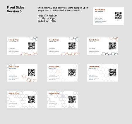
After the initial data gathering and research, I began to start the design process. Creating work for a client is typically an iterative process that requires a lot of back-and-forth editing and approval from the client to ensure that the project gets pushed along in the direction the client is satisfied with. Each stage had multiple iterations that were discussed with the client.
To help streamline the discussions with the client, ther various iterations were presented side-by-side and numbered or labeled. This helped the client clearly express preferences (such as being able to point out versions they liked or disliked) and helped keep discussions focused and timely so that they wouldn't drag-on.
Here were the core design stages we addressed from start to finish:
-
Initial Research (client information and "must have" content)
-
Layout (card orientation and placement of content)
-
Color Scheme
-
Fonts
-
Visual Motifs (including monogram)
-
Final Iterations
Iterations and designs were created and presented in Figma, while the monogram was created and edited in Adobe InDesign.
All personal information in the designs were changed for anonymity purposes. The placeholder information is fictional.


Final Designs
During the phase where we chose the color scheme, we had ordered some test/ sample batches of the card design via a printing company called MOO Business Cards in order to see how the color would look in the final product (digital colors are not always 1 for 1 in the physical world). Unfortunately, I cannot provide photos of the physical sample or final products because they reveal personal information of the client.
After some tweaks, the client and I settled on a final iteration for their business card. We again printed out a test batch of the final version to ensure it would look good and to fix any spacing or sizing issues with the text that would come up from the printing process.


Impact
The client had originally asked me to do this project a couple of weeks prior to a large networking event that they were attending. After we ordered a large quantity of physical cards using the final designs, the client expressed satisfaction and excitement with the final product!
After going to his event, he let me know that the card was very successful in fulfilling its purpose. He gave almost all of them away to various peers and potential employers. He even received explicit attention/ call-outs from multiple people regarding the design of his business card. They told him that the design was memorable, "cool-looking", and the physical quality of the card was nice to hold/ feel.
A few months later, he did update me again letting me know that he had several job interviews and eventually landed a role in his desired field of interest.
Learnings & Takeaways
Ideas for Revisions
This was the first time I designed a business card for a client. Although this was technically not a UI/UX project (it's closer graphic design/ branding), the overall iterative process that I walked the client through and the core design choices implemented in the designs were based on what I had learned during my time with Northeastern's UI/UX courses. Additionally, most of the digital designs were created the same way I design screens for website and mobile apps.
I learned a lot about communicating the designs to a client (specifically in-person this time as opposed to virtually) and how to steer weekly discussions in an efficient and productive way.
I also learned a lot about the challenges of printing physical media and maintaining client expectations about the final product when discussing their options.
-
If the project were longer, I would have probably offered more color and font options to the client. The choices I went with initially were already very limited because I did not want the client to feel overwhelmed by too much choice.
-
For general time management, I think this process was actually helpful, but perhaps the client would have gone with a different style if given more visual examples.
-
Also, my knowledge on fonts is a bit limited, and I did not have as much experience pairing fonts together well at the time of this project.
-
-
Although the client was happy with the final product, I think there was still room for improvement regarding the visual motif.
-
We only went with the honeycomb pattern because the client liked that shape to begin with. It doesn't really have any connection to their career and it only serves as an interesting visual for the eye to follow.
-
Perhaps we could have brainstormed more creative visuals that would tie in closer to their industry/ career.
-