Capstone Project
Date: Spring 2024
Timeline: 12 weeks
For: Final academic module at Northeastern University for the course "Capstone Project"
Stakeholders: Confidential (due to NDA)
Roles/ Responsibilites:
-
Group Leader
-
UI/UX Designer
Tools: Figma, Google Docs, Zoom

Download the Project Presentation PDF
(Currently being updated)
Download the Project Report PDF
(Currently being updated)
View the Interactive Prototype on Figma
(Currently being updated)
The Problem
My client is an independent financial coach who aims to provide counseling for people who are overwhelmed by their debt and lack a money mindset. The client requested designs for a standalone mobile app which would allow users to track their budgets, help them save for the future, create debt elimination plans, and finally provide calculation tools and educational content to help users gain a fundamental understanding of financial literacy.
The Solution
During the market research and brand discovery stages, we identified key design requirements to gain insight on scope feasibility and potential user challenges. Every week we received direct feedback from the client and our Professor, and by the end of the project I successfully led my team through a total of 11 screen iterations.
Each round of revisions worked towards improving informational hierarchy, user flows, and visual clarity to enhance navigation and attract users to the app while adhering to specific branding and styling requirements. Our final designs were created with a focus on balancing client requests with user-centered needs.
Initial Research
Brand Discovery
We began the project by first idenifying the current state of the client's existing website and brand identity. Determining what types of services they offer right now and what kind of end goals they have for the app was an important step in the brand discovery phase.
In addition to pinpointing the target audiences, we simultaneously looked into direct and indirect competitors to see what features would be useful to add to our designs.
You can download our Brand Discovery worksheet below to understand more of the process. Any identifying information about the client and their work has been omitted per the NDA.

What is the company/brand: The client's independent company offers individual or group coaching and speaking engagement services about financial literacy.
What the company/brand believes in: The client believes that anyone has the capacity to get out of any amount of debt with enough guidance. They believe that underpriviledged peoples should have equal opportunities to learn about their finances and start growing their own funds. Finally, they believe debt and finances are not something to be afraid of.
What services the company offers (Unique Value Point UVP): The client offers their own unique perspective and experiences about getting out of debt to draw lessons from. The site they run offers one-on-one or group coaching sessions aimed at underpriviledged peoples such as women of color. They also offer speaking engagements to larger organizations such as academic institutions and non-profit organizations. Audiences have the opportunity to learn about financial education, how to start and maintain a budget, and how to reduce and eliminate debt.
Current Brand Reputation/ Perception:
Positive Perceptions:
-
That the services provided will aid in helping audiences gain a better understanding of their finances and set them up for success for the future
-
That the client has relevant and relatable experiences with the target audiences that can help enhance empathy and understanding
-
That the client/ company cares about the struggles and personal growth of the audiences and that they are passionate about bettering the community
Negative Perceptions:
-
Lack of proof of effectiveness/ impact of services over time (no statistics or examples of in-depth success stories)
-
Lack of pre-established branding, credentials, and unique value (the client is relatively new to the scene and offers similar services to competitors)
-
That the company/ brand only caters to 1 audience type (branding perception on their site seems very selective, but the client wants to expand their reach)
Goals and Potential Brand Messaging:
High-Level Goals for the App:
-
Provide flexible ways for users to easily track, manage, and calculate their income, investments, and debt
-
Provide resources on financial literacy/ education
-
Inspire and encourage users to come back to the app regularly
-
Brand exposure to help increase online traffic towards the client's website and increase call to action to book a consultation
Messaging Examples:
-
Take control of your money
-
Conquer your debt
-
Build wealth, build confidence
-
Transform your money mindset
-
Spark conversations and ignite change
-
Join the Global Community
Competitive Analysis
In order to gain a better understanding of the current market landscape, our team conducted a SWOT analyses for 5 different existing direct competitors.
The matrix table below compares and contrasts various features between the competitors. Creating this allowed us to quickly identify what to include or omit in our designs. Presenting this to the client also provided them with a clearer understanding of any unique opportunities and how their app would fit into the the market space.

Target Audiences
For this project, we discussed and brainstormed who the client’s target audiences are by estimated percentages. While these figures aren't exact statistics, the exercise was designed to help the client evaluate and rank their intended audiences based on percieved importance. This approach makes it easier to determine how the client can market and brand themselves more effectively and accurately.
Main audience (45%)
Women of color who are overwhelmed by their debt and finances but don't have many resources to do so on their own.
Secondary audience (35%)
Debt-free seekers who need expertise in eliminating any current debt in order to become financially independent.
Tertiary audience (15%)
Saving investors who are looking for a better way to manage and track their finances for the future but lack ways to hold themselves accountable.
Quaternary audience (5%)
Students who have yet to fully understand their finances, especially those who are looking to gain knowledge early on and are ready to start building their financial assets.

Design Process
Site Map
The next step after the research was to create a framework for the app by creating a site map. A site map details all the content and sections that need to be added to the app and organizes that content in a hierarchy of importance.
It was important to plan out the major sections and specific pages of the app ahead of time in order to understand how users will transition from one section of the app to the next. Additionally, creating a site map made it easier for us to split up the work amongst our team of 6 people and to keep everyone aligned on the same goals and layout throughout the project.
We went through several iterations of the site map before settling on the one below. We had to take into consideration the key features that the client wanted us to include but also plan around existing mental models for how users should and would expect to navigate a money management app.
Here are the major sections of the app:
-
Homepage/ Dashboard
-
Plan section
-
Learn section
-
Profile, Accounts, & Settings
You can download and view the anonymized version of the site map below for more details.


.png)
Low & High Fidelity Wireframes
After the initial sketches, we developed some low-fidelity wireframes without any color, imagery, or styling. The focus was mainly on page layouts and content hierarchy.
There were a total of 6 iterations of the wireframes before we moved onto the high-fidelity interactive prototypes. Each iteration became more complex and detailed as we made changes.
For ease of viewing, only some key screens from the 1st and 6th rounds of wireframe iterations are shown below. If you would like to see all of the iterations, you can download and view the higher resolution wireframes as a PDF below.
Round 1 of Wireframes


Round 6 of Wireframes


High-Fidelity Prototypes
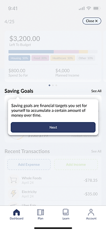
After a few rounds of the low-fidelity screens, we focused more on style. We developed a style guide to help keep colors, fonts, and iconography consistent throughout the app.
For ease of viewing, only some key screens of the finalized screens are shown below.
To view all the screens together at a higher resolution, navigate through the buttons below.




Individual Role and Contributions
For this project, I took over as the leader of a team of 5. My main role involved managing the members, delegating tasks, and speaking on behalf of my team during weekly meetings with the client.
Throughout the project, I focused on communicating weekly goals and expectations through our shared Figma file and on our group Discord chat. After each iteration, I would help address major changes that needed to be made based on weekly feedback from our Professor and the client. Additionally, I spent a significant amount of time each week bringing together each member's contributions, formatting, editing, and double-checking for last minute errors before submitting the deliverables. Although this was not required, I also helped organize and maintain consistent file management across all of our work platforms by creating and appropriately labeling shared documents, folders, individual design screens, and emails for a cleaner and easier workflow.
My personal contribution to the actual design screens were the Profile and Settings pages. In the later half of the project, I also contributed to editing and finalizing the Account pages. During the last 2-3 weeks of the project, I participated heavily in creating and finalizing both versions of our interactive Prototype for our client and final submission. Finally, I fulfilled minor requests by the client for extra files not related to the designs, such as creating a user survey, and I helped a few other members put together additional screens that were not directly requested like the style guides, and color palettes, and anonymized design screens (which are screens that do not reveal any sensitive information about the client).
Learnings & Takeaways
Ideas for Revisions
This was my first time leading a group project at NEU. My previous courses normally had smaller groups and no distinct leader. I found it rewarding but also challenging and definitely outside of my comfort zone. Advice from our Professor helped me greatly in learning how to lead my team. I'm used to working alone, so learning how to trust and rely on the capability/ expertise of my teammates was something I took away from this project.
Another aspect I took away from this project was learning how to balance the client's needs versus their wants. Although it was nice that the client was very easy-going, sometimes it was difficult to pinpoint exactly what they wanted or needed for the app to function properly. Tempering expectations and learning to work with limited feedback were essential skills for this project.
-
From the beginning, I think there was a lot of uncertainty and confusion over the intended target audience and how that tied into the goals of the app. We struggled a lot with how the overall structure of the app, and in the end, I think the app is trying to do too much at the same time. For example, the final product is a budgeting app that tracks and calculates your savings, spending habits, debt accural, and also offers instructional courses on how to maintain and fix your current finances and also plan for the future. These are all important things, but because the app has to equally focus on each of these elements, it made navigation and general flow of the site complicated.
-
If I were to work on this project again, I think we would have to limit the amount of features offered. In this sense, the app would do 1-3 things extremely well, rather than trying to keep the user engaged with 5-6 things that the app only does partially well. This also would have helped the project move along quicker and more smoothly, while also streamlining app navigation.
-
-
General incentive to use the app could have been improved on. Of course, sometimes you can't control what users will do, nor can you stop them from dropping the app altogether, but we can control how we encourage them stay engaged with the content. I think we hinted on some useful tactics, like including tooltips for learning, and basic gamification (i.e. lessons and rewards), but we could have leaned into those harder.
-
Fun visuals, clear visual motif, and more gamification aspects would have helped push this project further.
-
Unfortuntately, this project did not include actual coding, but if we had the ability to add audio cues and animation, I think that could've helped as well.
-
-
It's important to note that the project aesthetics had to tie directly back to the client's existing brand identity, however, I am personally not a huge fan of the specific color palette we decided to go with due to the clashing tones and how random the choices we picked seem. It doesn't feel cohesive, and in my opinion they don't really reflect the look and feel of a professional budgeting app.
-
If I had to go back and change the colors, I would've gone more in the direction of the pastel colors (such as pink, yellow, and light blue) and really limit the use of some of the colors. The app is intended to target young women and includes fun/ playful elements, so keeping the color palette light and clean probably would've worked better.
-